

11
Rate My Buildphoto_size_select_actual
 Cubert_4x4
 Apro87
So, How'd I do?
I'll take any constructive criticism, and i should be back to post another build soon.
This one was just a day one type thing of a challenge I might post on YT, to see how good my building skills are. :D
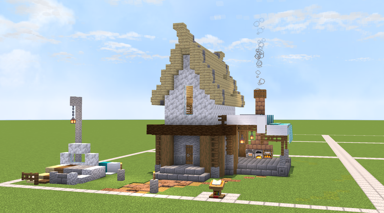 Do I need more picture angles? probably. Oh well I'll do it next time.
If the image breaks here's a back up: LINK
I'll take any constructive criticism, and i should be back to post another build soon.
This one was just a day one type thing of a challenge I might post on YT, to see how good my building skills are. :D
Do I need more picture angles? probably. Oh well I'll do it next time.If the image breaks here's a back up: LINK
Poll ended 03/01/2024 11:58 pm.
Create an account or sign in to comment.
18
2
Dangggg. Pretty good. Your average medieval house I'd say.
2

As Someone Bad at Building(not the interior though), this is a 10/10
2

Looks great, but I'd recommend throwing in some diorite and other white stone blocks with the calcite, just to give it some more detail.
2

looks pretty good but the roof is throwin' me off
3

I think someone else might have talked about this in the comments, but the birch roof and calcite clash a little bit. I might recommend using spruce planks instead to help balance the build’s colors and draw the build together a bit more.
Really cool build! I like your block pallet a lot :D.
Really cool build! I like your block pallet a lot :D.
4

very very nice indeed! better than i can come up w on my own LOL
but maybe a bit more variation on the calcite? wool or concrete would do :3
but maybe a bit more variation on the calcite? wool or concrete would do :3
2
Didn’t think of wool! Thanks mate!
2
ofc!
3

That looks really nice dude!
A few critiques though,
1. The roof shape is nice, but the white roof on the white wall creates a bit of an ugly contrast, along with the stone bricks inserted into the roof. To fix this, I’d recommend returning to using spruce as the roof, this creates a nice line of white to the middle, making a center of attention.
2. With the wall being all one solid block, the attention isn’t drawn to any one specific place, nor does it have any interest. I’d recommend adding some texture, maybe the diorite slowly blends into the intersection with the roof?
These are mainly personal tastes, other than that, great build!
2
You’re totally right blue. I should have made the roof blue. And thank you for your advice! :D
2

It's really good, but I think the calcite part looks kinda bland, and needs some detail in it, like maybe a few trapdoors or something.
2
Hmmm…
4

(Assumption: the ground represents a 2x2 chunk size limit.)
Good looking decorative housing, but not what I would think of as a "a day one type thing" — too many (& too much use of) comparatively expensive materials. (The calcite might be available with good luck, and the same may ve true of the light blue wool, carpet, & banners[?] as well as the mud bricks; taken together it doesn't seem likely one could acquire all this on day one. [Possibly on IRL day one depending on how much one played.])
Ignoring that aspect: aesthetically, it's nicely done (although not very practical for my playstyle); the one serious objective issue I see is that there does not look to be sufficient lighting in some areas (This may be a product of angle and single shot.)
The small structure at VL is interesting: would that be a well?
2
Dang that’s a lot of advice TYSM, now let me clear stuff up:
that “well” was just a pallet area that I threw down, and it’s day one in like “I try to build to improve” kinda thing. Your also freakishly spot on with the size of the plot, each one is 30 blocks wide, with 2 block paths. And you’re right, I probably should’ve put more light in. Thanks again! :D
that “well” was just a pallet area that I threw down, and it’s day one in like “I try to build to improve” kinda thing. Your also freakishly spot on with the size of the plot, each one is 30 blocks wide, with 2 block paths. And you’re right, I probably should’ve put more light in. Thanks again! :D
4

It looks pretty nice, I'd say to use more than one block for certain parts (like with the calcite) it makes it a bit more interesting and just overall more appealing
2
Thanks!
2
np!
4

try mixing a bit of diorite with the calcite and add a few trap doors here and there you know.
But yeah that surely looks better than my houses
But yeah that surely looks better than my houses