

1 - 20 of 36
thenubslayer2000LuckyLeprechaunHere's just a little concept idea that I made. http://imgur.com/jTjw0CM I made it orange and white because those are the colors of your existing logo.
I'm sure it doesn't look good but it's just an idea, not a finished piece of art.
It sorta looks weird from a distance, and I'm trying to fix that but I have no idea what's wrong.
The UI is still nowhere near finished. But the icons (not the ugly placeholder icons, the ones with the text) will stay unless I get more negative feedback on them, cause I'm fond of them. The issue is i want it to be super clear to be seen on the device and I don't think yours will be. Functionality over design.
No. Not functionality over design. The image should be easily seen and look good at the same time. You can't choose one over the other.
That was a concept, not a finished design. Right now it looks like you just filled a square image with a solid color, wrote whatever the icon was in generic font and that was good enough. It's not. They look lazy and unprofessional.
Anyways, here's another concept I had, with metro-like icons. This is just a quick idea so it's not a professional drawing or something.
http://i.imgur.com/kfJsSX6.png
I did say those were PLACEHOLDER icons. In absolutely NO way are they staying! I'm talking about the new ones, which I actually haven't shown you yet! We're misunderstanding eachother. The new icons are in the next update, whoopsie! The new icons are nice and clean, designed by the same person who made the website, Vextek.
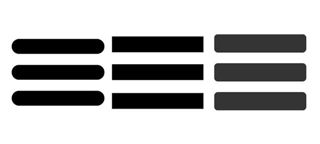
A little sneak peek of the icons I was talking about:
Ummm...Lolwut...
Yeah, maybe it's been used before. Just like how old style telephones are used for smartphones everywhere and the hamburger icon above is used for menus everywhere.
Here's just a little concept idea that I made. http://imgur.com/jTjw0CM I made it orange and white because those are the colors of your existing logo.
I'm sure it doesn't look good but it's just an idea, not a finished piece of art.
It sorta looks weird from a distance, and I'm trying to fix that but I have no idea what's wrong.
The UI is still nowhere near finished. But the icons (not the ugly placeholder icons, the ones with the text) will stay unless I get more negative feedback on them, cause I'm fond of them. The issue is i want it to be super clear to be seen on the device and I don't think yours will be. Functionality over design.
No. Not functionality over design. The image should be easily seen and look good at the same time. You can't choose one over the other.
That was a concept, not a finished design. Right now it looks like you just filled a square image with a solid color, wrote whatever the icon was in generic font and that was good enough. It's not. They look lazy and unprofessional.
Anyways, here's another concept I had, with metro-like icons. This is just a quick idea so it's not a professional drawing or something.
http://i.imgur.com/kfJsSX6.png
I did say those were PLACEHOLDER icons. In absolutely NO way are they staying! I'm talking about the new ones, which I actually haven't shown you yet! We're misunderstanding eachother. The new icons are in the next update, whoopsie! The new icons are nice and clean, designed by the same person who made the website, Vextek.
A little sneak peek of the icons I was talking about:
IrishChaosthenubslayer2000
If you still don't get it, there isn't much more point in me trying to explain again and again...
A'huehuehue.
I do get it, but you haven't really told us any actual ways of how this will work, and actually, you haven't answered my question. You told me that it won't merge Virtual and Reality, yet you advertise as an AR headset, Waiting on a real answer.
1 - 20 of 36


